Aurora
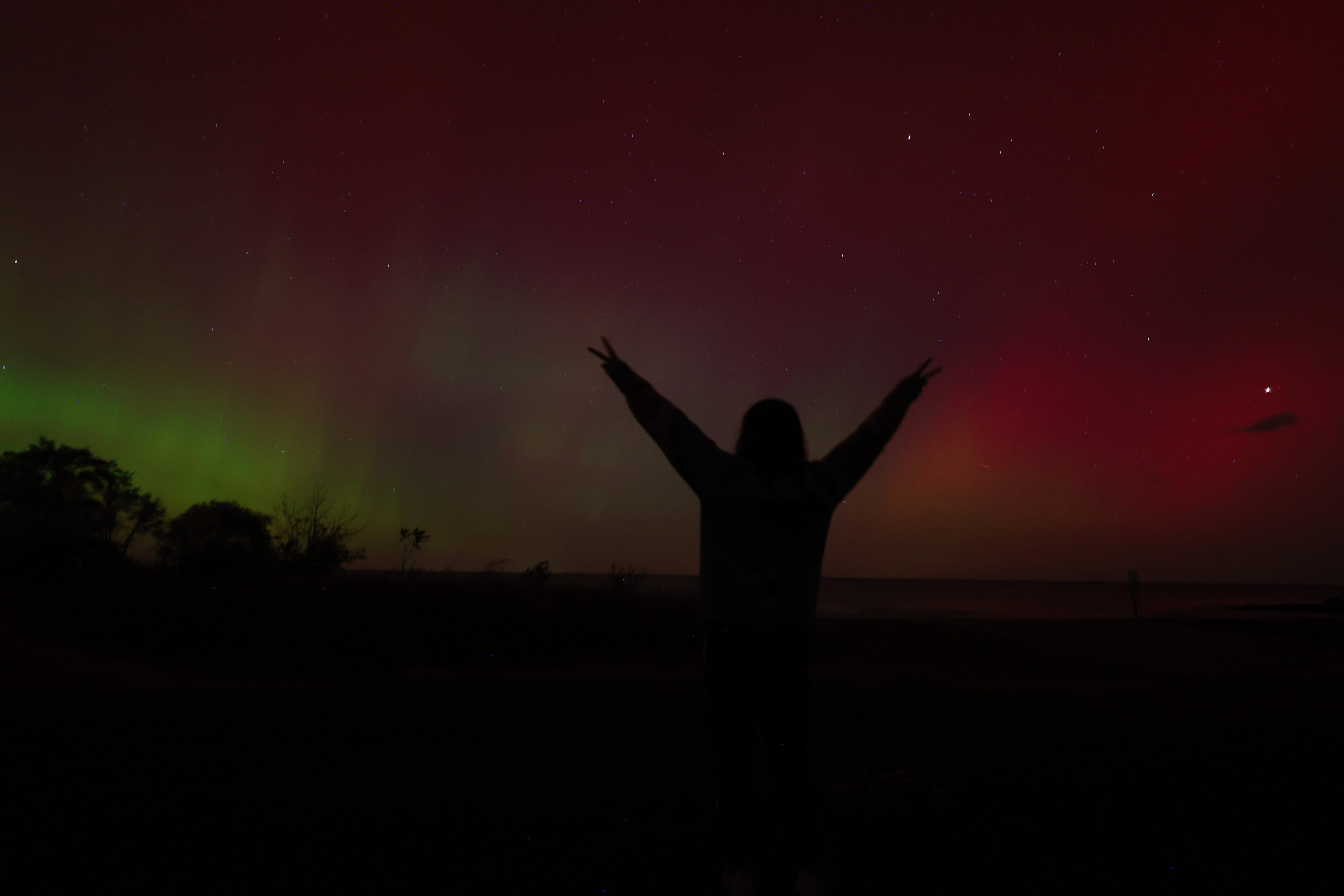
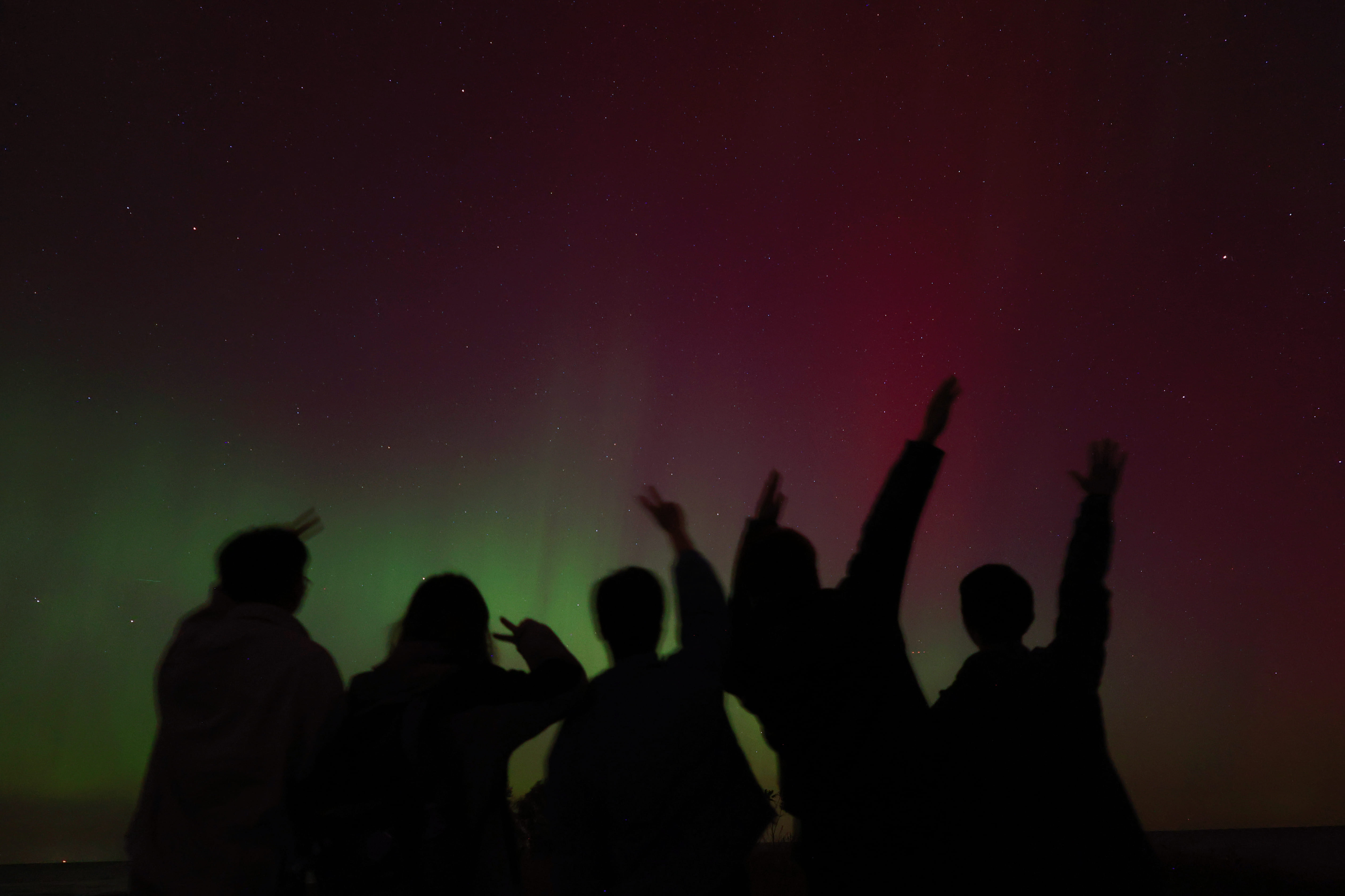
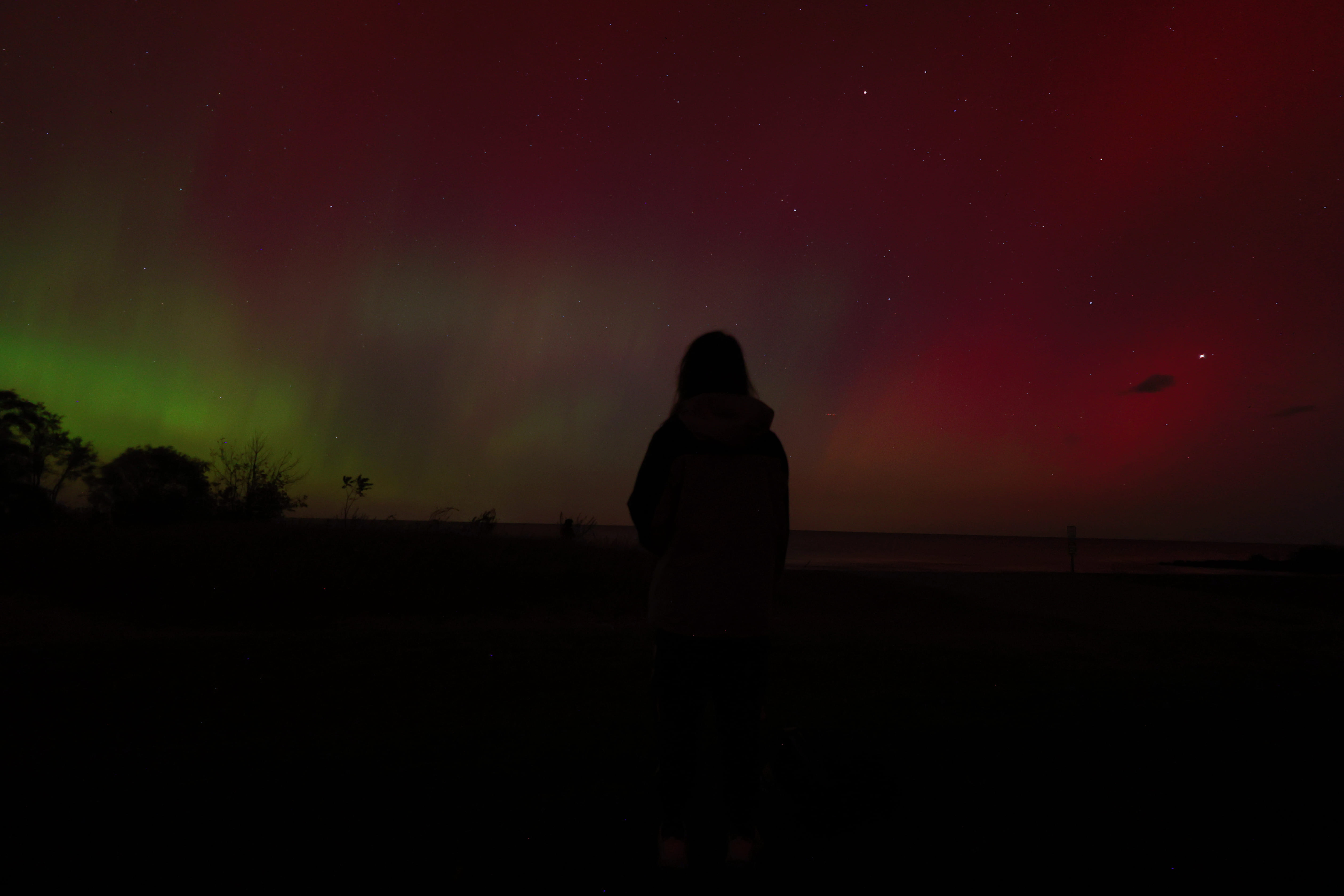
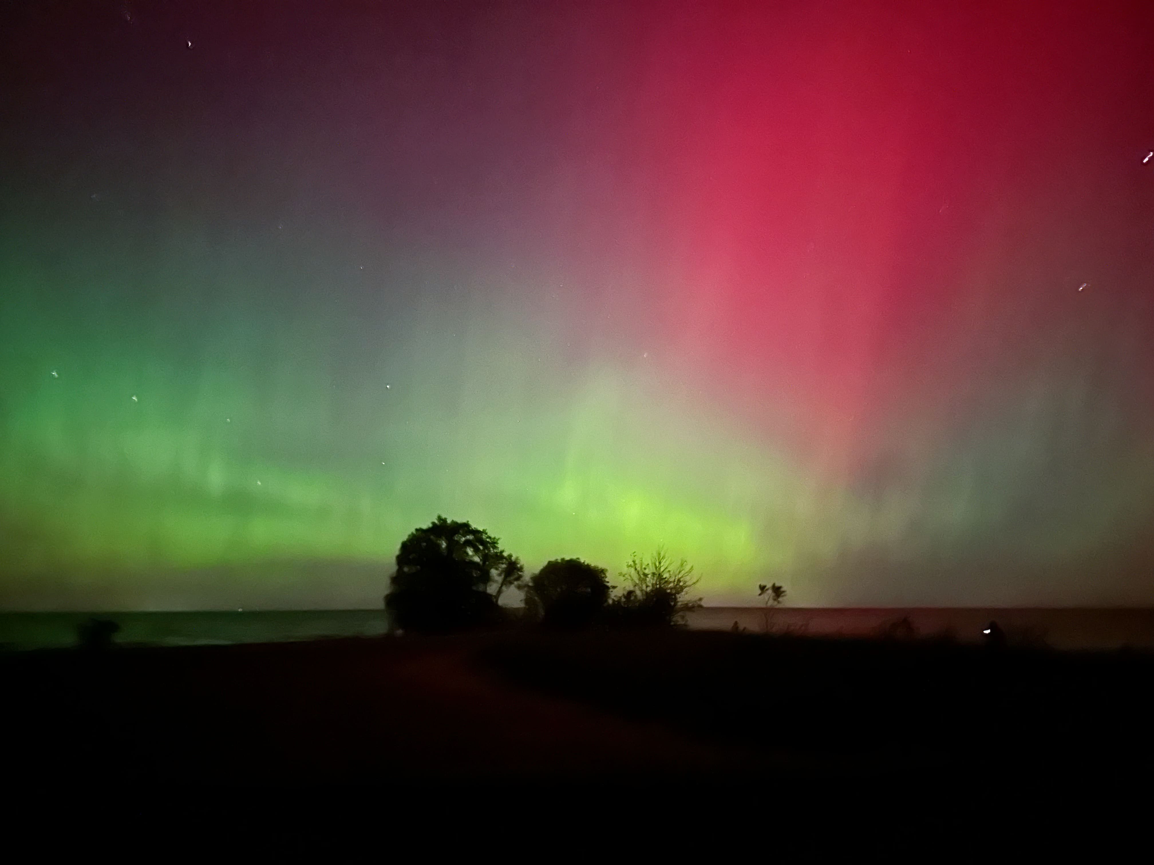
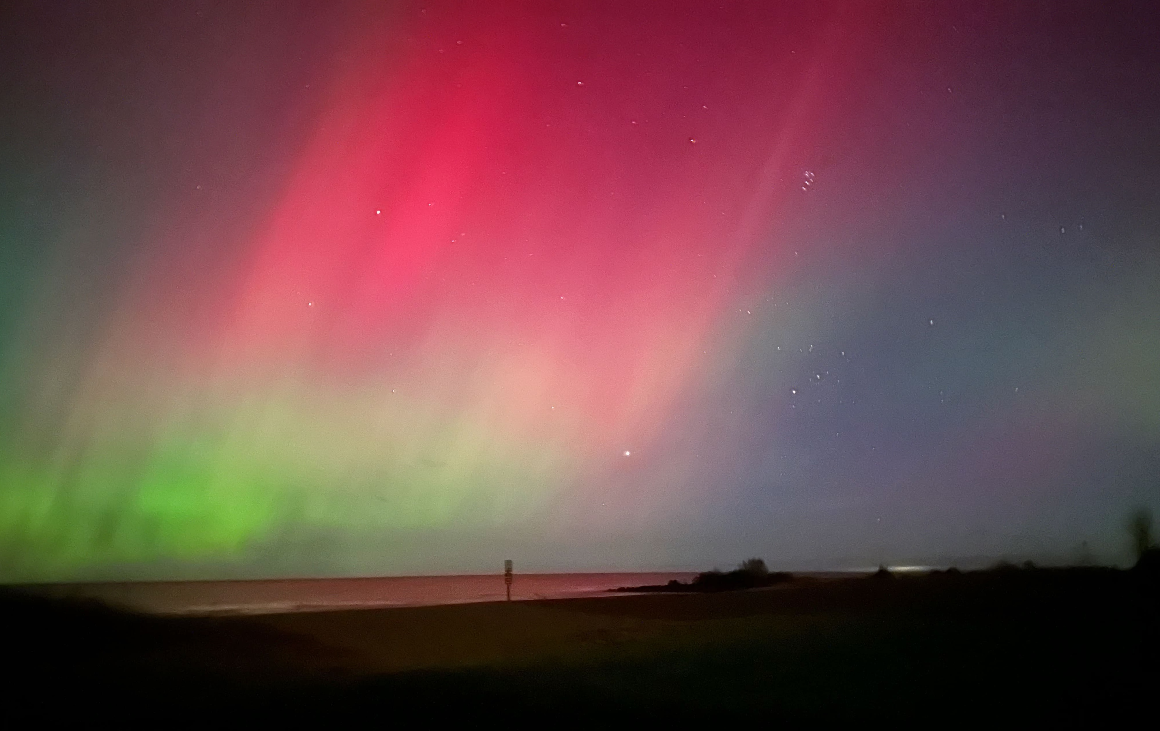
Aurora, 11pm, 10/11/2024, in Hamlin Beach State Park

The code is simple. Just wrap your images with <div class="col-sm"> and place them inside <div class="row"> (read more about the Bootstrap Grid system). To make images responsive, add img-fluid class to each; for rounded corners and shadows use rounded and z-depth-1 classes. Here’s the code for the last row of images above:
<div class="row justify-content-sm-center">
  <div class="col-sm-8 mt-3 mt-md-0">
    {% include figure.liquid path="assets/img/gallery/aurora/WechatIMG955.jpg" title="example image" class="img-fluid rounded z-depth-1" %}
  </div>
  <div class="col-sm-4 mt-3 mt-md-0">
    {% include figure.liquid path="assets/img/gallery/aurora/WechatIMG714.jpg" title="example image" class="img-fluid rounded z-depth-1" %}
  </div>
</div>